Guide to Pairing Office Cubicle Colors with Carpet and Office Decor
The fun part of an office renovation is choosing the color schemes and designing how you want it to look.
It’s important to consider colors and patterns that are pleasing to the eye, promote creativity, and are something everyone in the office will enjoy to increase productivity and employee engagement.
To make the decision making a bit easier, we created a guide with some of our favorite pairings, as well as some of our suggestions for the optimal office design.
Colors for Productivity
The psychology of color and the emotions it can trigger has been used in art and film for 100s of years. The color of a piece can derive a certain feeling or emotion from the viewer, and the same goes for your home and the workplace. Depending on the color of the room, you may feel excitable, relaxed, focused, or angry. In the workplace, you want people to feel comfortable while also being focused and productive. Applying color psychology to the renovation process can pay off in the long run.
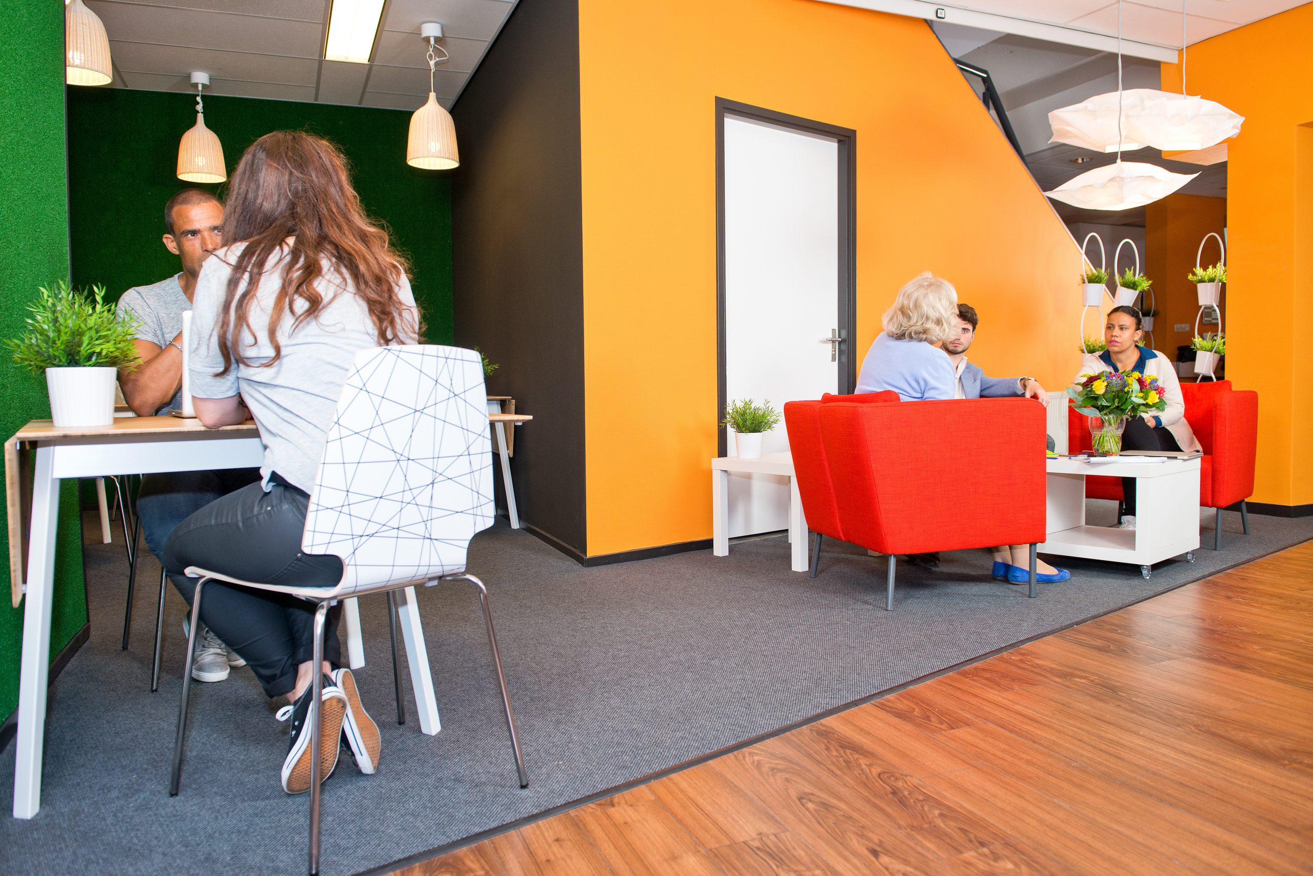
Blue – The most widely chosen color by Americans may also be the color that is best for focus. Blue is considered tranquil, calm, serene, cool, honest, secure, and dependable. It is the perfect color to integrate into areas of the office that require focus and dedication. It could work great for offices and project areas.
Red – Red is a much more aggressive color than blue and is sometimes associated with anger or as a warning. However, it also is very stimulating, provocative, and powerful. Red gets peoples’ attention and can be very effective when done in the proper amounts. Look at Target, for example. Their red logo is recognizable anywhere. It draws the eye to the bright red, and the red colors in the store can trigger excitement and stimulate people when making purchase decisions. Red in small doses can bring a sense of urgency, and in turn, more productivity.
Green – Green is a very natural color that is very inviting and comfortable. Green can be great for areas that frequently hold meetings or lectures. It complements many other colors and also gives a feeling of wealth and satisfaction. Green and shades of green can work well in lobby areas as well, inviting guests and employees into a comfortable, natural environment.
Yellow – Yellow is a color that can make people feel anxious and tense. It’s a little too bright and not as subtle as other colors, so using something on that spectrum like orange or gold, work much better as being trendy, motivating, and complementary to darker colors like the blue you are using on main walls.
Best Carpet Colors
If your office has carpet, which many do, choosing one that works with any color or decor is the best thing you can do. Stay away from carpet that is trendy, or has speckles or striped patterns in it. These can quickly become outdated and don’t go with any wall color. Also, going low pile is a good choice. It is easier to clean, and won’t fray or flatten overtime with heavy foot traffic.
Gray is the most commonly used color for office carpet. It is neutral and goes with anything. It is also a cool calming color and can hide tread marks well. A beige is also a good option if you are looking for a neutral color, but it can clash with certain colors and may need a shampoo more often than gray. Shades of green like a soft leafy green or muted olive tone are said to be very welcoming, calming, and promote attentiveness. These colors can be great for lecture rooms or rooms where people work on large scale projects. It gives more of a homey feel, and breaking out from the same carpet in the entire office can give those rooms special meaning, and make them feel like a separate workspace completely. This can help with productivity.
Wall Painting Configurations
Painting all the walls the same color is a fine choice for office aesthetic, but accent walls can have an amazing effect on both the feel of the room and help maintain focus. Painting one accent wall in a conference room or office space can completely change the room. A dark blue wall in conjunction with three gray walls can draw focus to that area, and is easy on the eyes. If it’s the wall with the TV or whiteboard, it helps to focus on that wall by softening the surrounding space. Painted accent walls work best with a darker color contrasting to lighter walls around it, and on a wall without a lot of windows.
Wallpaper (temporary or permanent) can make a cool accent wall in a lobby or common area of the office. There is such a thing as temporary wallpaper or murals you can get printed and fit to match the exact section of the wall, and if you lease your office space, it can be a beautiful renovation that is easily removed and won’t damage the space.
Stone or tile can also be a great way to bring texture and uniqueness to a room with an accent wall. A textured accent wall can be a great stylish piece for both employees and guests. It’s like an art installation without being too distracting or drawing the eye away from work.
Complementary Color Schemes
We all learned about the color wheel in elementary school and how complementary colors live across the wheel from each other. We’ve got blue with orange, red with green, and purple with yellow. There are some cool ways to use like-colors to complement your gray or neutral office tones with a splash of color. With a neutral gray, you could try the following complementary color schemes:
Peach and Peacock

Lilac and Mustard

Burnt Orange and Navy Blue

Magenta and Caramel

Periwinkle and Tangerine

Mauve and Gold

Minnesota Office Furniture wants to help you customize your cubicles and office furniture to be on-trend while promoting productivity. We would love to help you achieve all of your new office goals, so give us a call and let’s get started!


